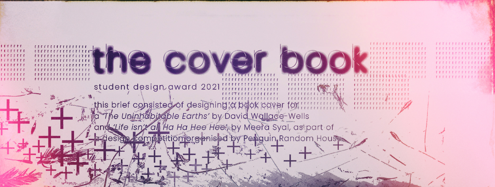
This brief consisted of designing a book cover for a ‘The Uninhabitable Earths’ by David Wallace-Wells
and ‘Life isn’t all Ha Ha Hee Hee’, by Meera Syal, as part of a design competition organised
by Penguin Random House.
and ‘Life isn’t all Ha Ha Hee Hee’, by Meera Syal, as part of a design competition organised
by Penguin Random House.
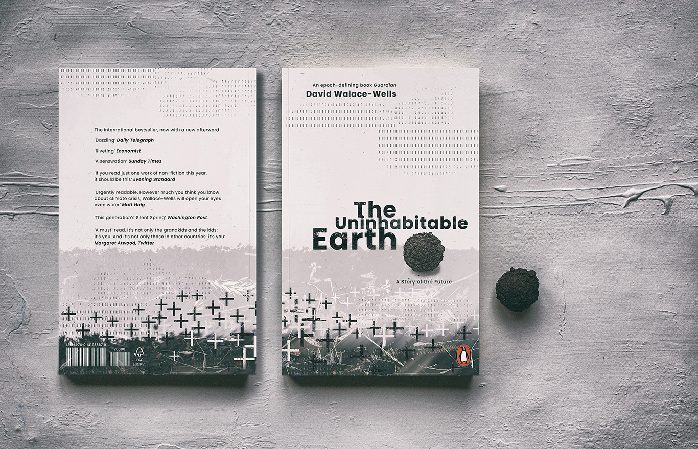
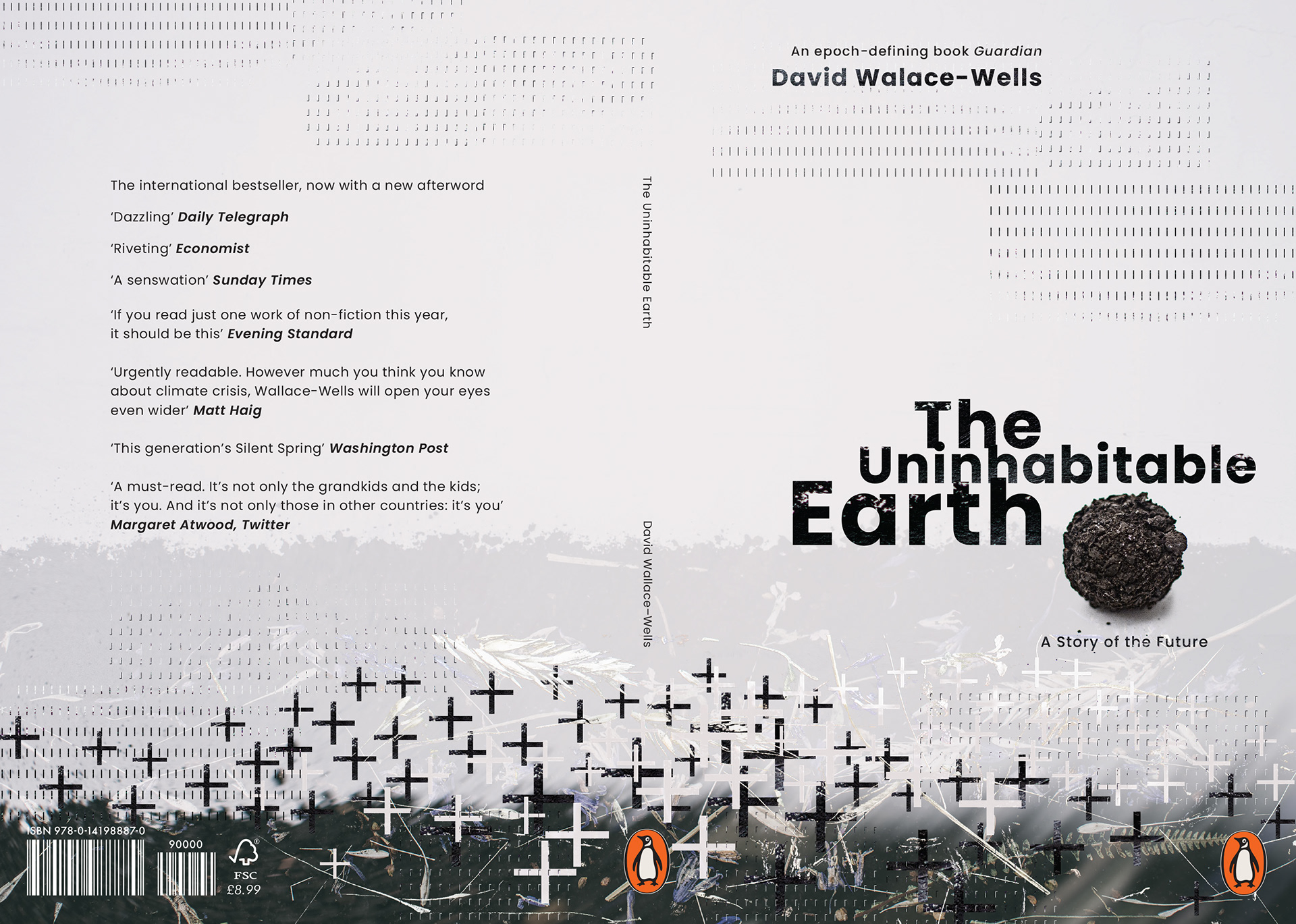
The Uninhabitable Earth
‘Without a revolution in how billions of humans conduct their lives, parts of the Earth could become close to uninhabitable, and other parts horrifically inhospitable, as soon as the end of this century.’
The Uninhabitable Earth is both a meditation on the devastation we have brought upon ourselves and an impassioned call to action.’
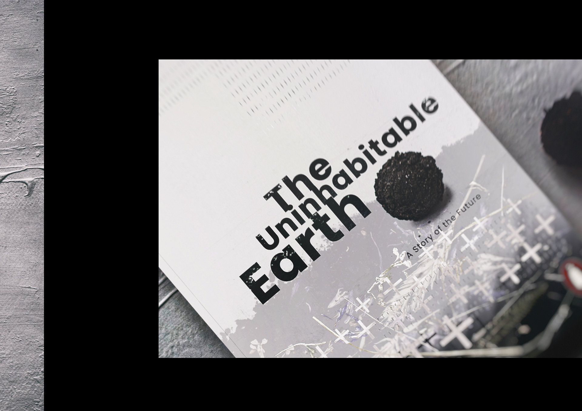
Cover represent disintegration and death. The dead plants sticking out of the ground, a ball of soil representing empty land but also signifying the end. The final design clearly communicates the concept
of imminent threat, via the application of crosses and dead plants. Inspired by many modern sans serif fonts I chose typface Poppins, it is neutral and trustworthy, ideal for ‘The Uninhabitable Earth’ which is a well researched, credible and knowledgeable investigation, and report into climate change.
of imminent threat, via the application of crosses and dead plants. Inspired by many modern sans serif fonts I chose typface Poppins, it is neutral and trustworthy, ideal for ‘The Uninhabitable Earth’ which is a well researched, credible and knowledgeable investigation, and report into climate change.


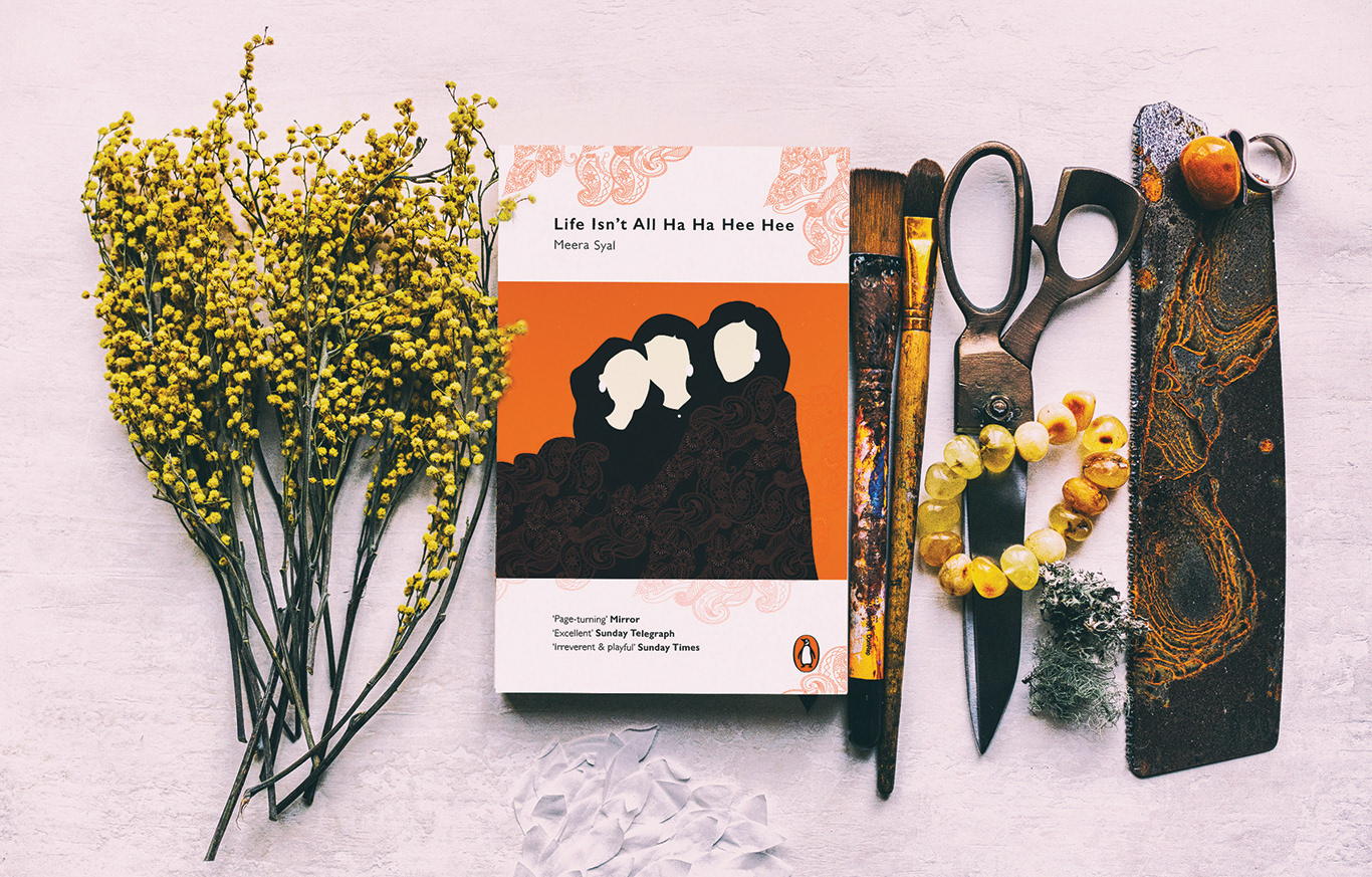
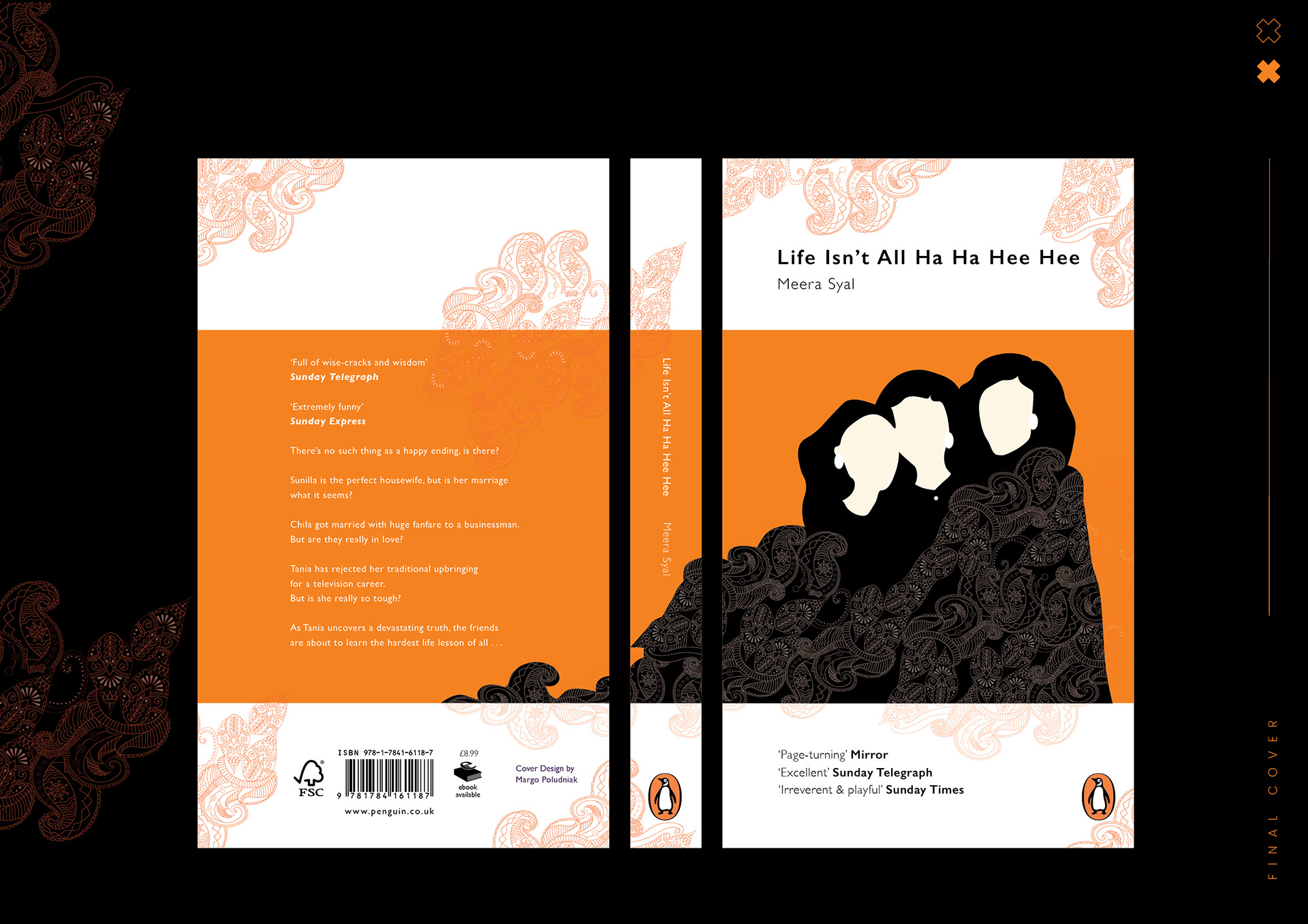
Life Isn’t All Ha Ha Hee Hee is the story of Deepak’s bride, the childlike Chila, and her two childhood friends:
Sunita, the former activist law student, now a depressed housewife, and the chic Tania, who has rejected marriage in favour of a high-powered career in television.
Sunita, the former activist law student, now a depressed housewife, and the chic Tania, who has rejected marriage in favour of a high-powered career in television.
A hilarious, thoughtful and moving novel about friendship, marriage and betrayal, it focuses on the difficult choices contemporary women have to make, whether or not they happen to have been raised in the South Asian community.
I was inspired by the colourful imagery within the book and I chose a cover styled with classic features of
the Penguin publishing house, including the dominant orange hue and elliptical Penguin logo, all accompanied by the Gill Sans typeface.
the Penguin publishing house, including the dominant orange hue and elliptical Penguin logo, all accompanied by the Gill Sans typeface.